Showing posts with label special techniques. Show all posts

Thursday, September 7, 2017

pop up cube card

Hi friends.  You may have noticed that I haven't posted anything in ages.  I think there are days (maybe weeks, even) that I completely forget that I have a blog.  Must be senior brain cells at work. 

Anyway, today I made a couple of birthday cards for the neighbor boy and girl across the street.  They have birthdays on consecutive days. 

I made a girlie girl card for her. 
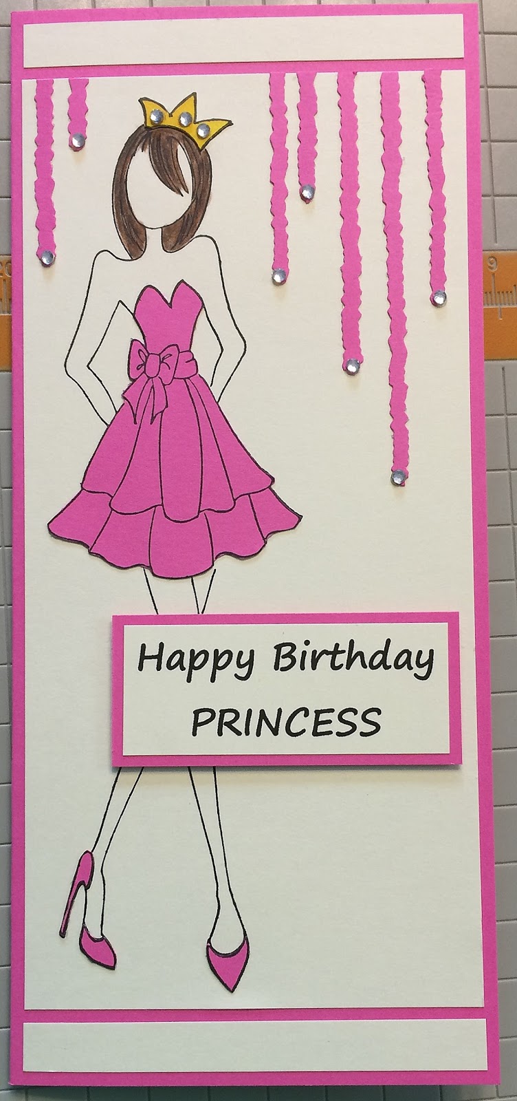
The stamp is one of the Prima mixed media dolls by Julie Nutting.  I did paper piecing for the dress, shoes and crown, and colored the hair with watercolor pencils and blender pen.  I added some streamers, which were cut with deckle scissors, and added some rhinestones. 

Because he is very involved in baseball, I had to make some sort of baseball card of course.  Some time ago, I made a fun pop up cube box following this video.  It's really a fun card, but the thing I don't like about it is that it isn't flat, so it doesn't mail easily.  I did a little browsing online and found some ads showing more of a wrap than a box, so I decided to figure out how to use that instead of the box.  I did see a video that made a cube inside of a card, but the dimensions were smaller and the girl doing the video used a tool which I don't have, so I would need to refigure all the dimensions, and I really didn't have time to, if I wanted to get the card done today.  Instead, I realized that the 3" cube would fit inside a 3-5/8"x6-1/2" envelope, so I made the wrap 3-1/2"x6-1/4" to fit that, and the cube fits inside flat.  This is the front outside of the wrap. 
This is the back side.  I made a slit and a tab to fit in it, which holds the card closed.  My camera died last week, so I've been using my phone to photograph my cards.  I've no idea why this came out vertical. 
The paper is kraft, so I used a sponge dauber and white pigment ink to press and twist a bit to make the baseballs white.  I heat set them to make sure the ink was dry.  When you pull the tab out, the cube inside literally flies out - really fun.  I think it actually works better than in the box, because if you don't pull the box out quickly, you really don't get the pop.

Here is the card open.  

Thanks so much for stopping by. 

Saturday, September 24, 2016

choo choo

Hi friends.  I've been having fun with waterfall cards lately.  Originally, I think these were meant to be vertical, so they actually represented a waterfall, but I've seen also some horizontal ones.  I've been using the horizontal layout.  Sometimes, I think either would work, but occasionally, the horizontal style is necessary.  They appear to be a complicated card, but really are rather simple.  I've also done some experimenting with the size of the actually moving parts. Here are some I've recently made. 

I made this floral one for a technique challenge on SCS.  Then I used it as one of the techniques in my class this month.  I realized that as long as the moving parts fit underneath the brace strip, I could pretty much do anything on this.  The butterfly extends beyond the pull strip, but is on on stationary part of the strip. 

This one was a card request by my DH for a friend he plays volleyball with.  These are the colors on their shirts. 

And this one was made for a little 4 year old boy who loves trains.  He just had some surgery and I hope this will cheer him up.  I really stretched the parameters on this one.  I made the pull strip 1/2" wider than normal, and all of the train cars extend above or below the strip, but I made sure they would still fit under the brace.  Because this card will most likely be played with a bit, I doubled the eyelets on the brace for more stability.  The engine.

The coal car. 

The box car. 

And the caboose. 

Thank you so much for stopping in for a visit today. 


Tuesday, August 23, 2016

another mug rug

Hi friends.  I apologize that this blog has been so neglected.  It's not that I haven't been creating, because I have. 

The last weekend of July and the first week of August was the Dare to Get Dirty Challenge scramble (haha, for want of a better description) on SCS.  The challenges are for SCS fan club members only as a special thank you for supporting the site.  This is an annual event, and this year there were a total of 42 challenges during that week.  There are random prizes drawn for participants, and some special prizes for those who create a separate card for each challenge, also called the challenge queens.  I qualified as a queen this year, so by the time the week was over, I was pretty exhausted.  I happened to win one of the prizes this year, which I think is pretty cool. It's a $25 gift certificate for Serendipity Stamps.  I'm going to have a hard time choosing. 

Here are a few of the cards I made that week.  For Dina's challenge:

For Alba's challenge: 

For Angie's challenge: 

For Sabrina's challenge - the flowers on this one were colored with milk & heated - a rather fun technique: 

For Robin's challenge: 

For Bev's challenge: 

For Nancy's challenge: 

I could add more, but maybe in another post. 

I also wanted to show you the special mug rug I made for Lydia's birthday, which is Wednesday.  She has a couple of rescue cats, and designed a cat image for some merchandise.  I wanted her mug rug to be meaningful to her, so I used her cat image as a starting point.  The cat is hand appliqued and the features are machine appliqued.  I did a lot of funky hand quilting in the background. 

I hope she loves it.   She should have received it, so I feel free to post this. 

Thank you so much for stopping by today. 


Tuesday, July 19, 2016

just saying hello

Hi friends.  Today I made a card for last week's alphabet challenge post #2183 on splitcoast.  It was week 26, which meant the letter Z.  A 2nd part of the challenge was to add up the numbers in your zip code & also use the letter that number represented.  Mine added up to 25 (Y). 

I thought I had finished my card, took photos, & started to write this post, when I realized that I had forgotten to do part 2 of the challenge.  Oops!  So back to add some yellow for Y, retake all the photos, crop, etc.... and here I am. 

I made a waterfall card.  It's a fun interactive card that looks really complicated, but actually is not hard at all, if you have some good directions to follow.  Splitcoast has a great tutorial, and there are also others online, including videos.  I used a bit of both, but then made some slight alterations in the measurements to fit the stamp image.  I also made my waterfall mechanism horizontal instead of vertical.  I also added the round tab punch to act as a pull tab. 

Here is the card before you pull the tab to activate the waterfall.  I made some stripes with black and white cardstock.

And as you pull the tab, each image becomes visible. 

The next one is zebra striped paper.

And with the tab fully extended.  

Here is a closeup of the zebra image. 

If you've never made a waterfall card, I recommend that you try it.  It's really a fun card. 

Thank you so much for stopping by today.  Have a great day. 

Saturday, February 27, 2016

flying butterfly pop-up card

Hi friends. 

Lately I've been working on cards that are a bit different than your typical A2.  I love cards that have something unique about them.  Splitcoaststampers has a tutorial section that has fun techniques, as well as cards that have unique folds or are interactive.  Of course, there are many other sources for fun cards as well.  Pinterest is another favorite of mine, although sometimes it's disappointing to follow a link only to find no instructions. 

The instructions for this card I have to show you today were found on Jill Berry's blog.  The way the card is put together makes the butterfly wings flap.  Very fun. 

I made one for my man for valentines day, and he couldn't figure out how to make the wings flap, so I decided to add the word pull on each edge. 

Isn't it fun.  If I knew how to do a video, I'd show it in action, but I haven't figured that out yet.  Maybe someday... 

Thank you so much for taking time to stop by. 

Monday, October 12, 2015

Dr. Who?

Hi friends.  My husband (and my kids) love science fiction, and Dr. Who is right up there.

When SU came out with the set Feeling Sentimental, I knew that the telephone/police box would be perfect for a Dr. Who card, so I bought it.  It's been sitting on my stamp shelf ever since.

SCS recently posted a technique tutorial called burst through.  I was trying to think what stamp I could use and suddenly remembered the police box... PERFECT!

I stamped the image and colored it with watercolor pencils.  I added the light at the top & filled in the light and top two rows of windows with a white gel pen.  Then I cut it out.

For the background, I used color box petal point chalk ink pads in a variety of colors direct to paper for the burst of color.

When I was rolling the little wedges of paper, I got a little heavy handed and tore the paper all the way through the edge.  Oops!  I decided it wasn't too bad and just glued and taped it back together.  This card is actually version 2.  I didn't like how dark the area behind the Tardis was - not enough contrast.  See for yourself.  Here's version 1.  What do you think? 

Thanks so much for stopping by.

Monday, December 8, 2014

more

Hi friends.  I just had to share a couple more sonobe balls.  I'm not really calling these ornaments, because they are just too big for the tree. 

When I first started making these, I was curious as to how well it would work using brown paper bags, not the flimsy flat ones, but the heavy ones from the grocery store. 

I made two different sizes, two with 4" squares and one with 6" squares.  It is definitely easier to put together the larger sizes, but I did find out that because this paper isn't as smooth, that was actually an obstacle when putting the pieces together.  I think it would have been close to impossible to use this paper on a smaller ball. 

The gold one is painted with gold Lumiere paint.  And for the one in the front in this next picture, I stamped each square with a burlap background stamp from Cornish Heritage Farms in coffee archival ink.  After it was all put together, I coated it with matte Mod Podge.  I love how that one turned out. 
And just for comparison, here is the biggest one along side one of the ornaments.  I think I'm going to paint the large one, but I haven't decided on a color yet. 

You can really see the detail of how the pieces are tucked into each other. 

Thanks so much for stopping by. 

Sunday, December 7, 2014

experiment

Hi friends.  If you've read my last couple of posts, you know that I've been making sonobe ornaments.  All of them have been made using recycled paper - some that has been printed on one side and discarded for some reason or other,

and some that was (glossy) magazine or catalog pages. 

I have discovered that the glossy paper isn't very receptive to some of my paint, so I either must use the colors that will cover the print, or first coat the paper with gesso.  Both are great solutions, but the gesso is just an extra step, and drying time prolongs the process.  The computer printer paper works much better for the lighter colors of paint. 

The problem -- I made a lot (and I mean a LOT - well over 100) of the ornaments in glossy before I discovered that little problem. This is a grocery bag about half full.  These are just the unfinished ones.  I have many on my tree and have given away quite a few as well. 

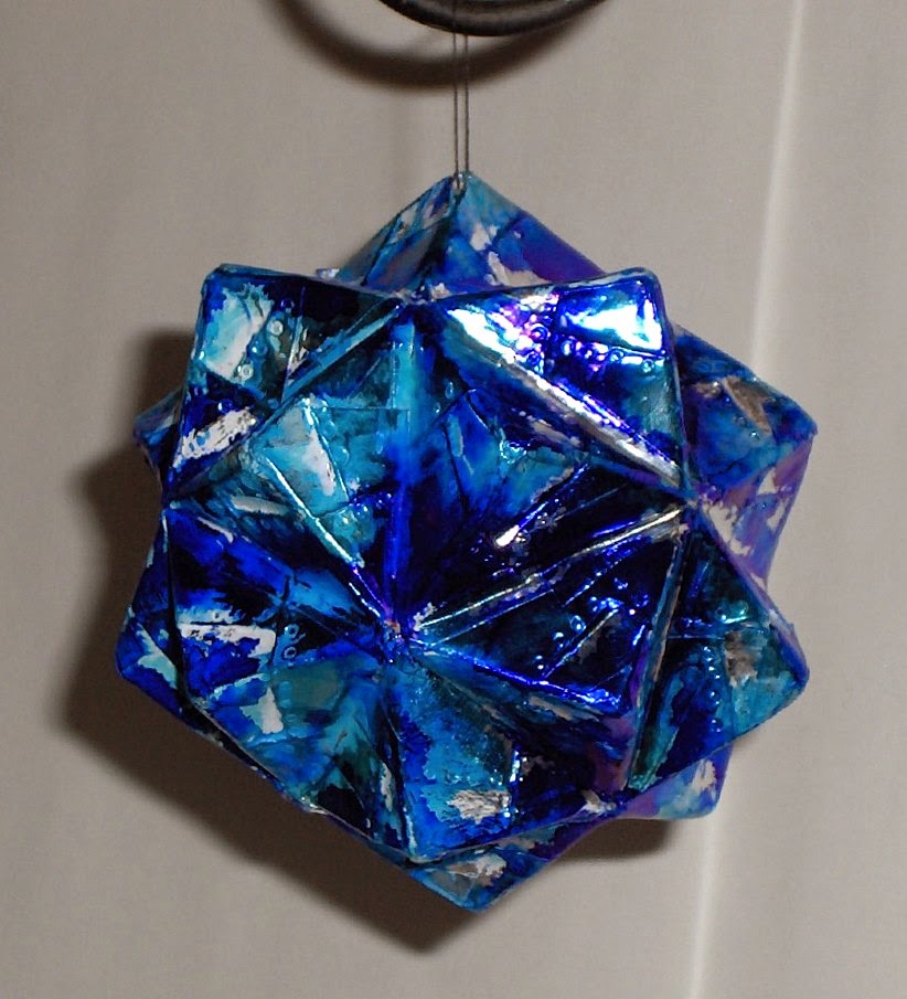
As long as I had a good supply to work with, I decided to try a technique called faux metal figures.  It requires that you completely cover your piece with foil adhesive tape.  Needless to say, this took a long time because of all the pyramids and valleys.  Then you use the point of a pen, stylus, mechanical pencil, etc. to make 'rivets'.  Sadly, these barely show in the finished piece. 

When I came to this point, my ornament was very shiny and bright.  I wanted to tone it down a bit, so I tried white acrylic paint.  Because the tape doesn't absorb any liquid, I had to wait a long time for the paint to dry.  By that time, I knew I didn't like the paint on it.  I attempted to remove the paint, but it was impossible to get it out of the crevices.  Frustrated, I decided to cover it as much as possible, so I used polished stone technique with alcohol inks.  I left much of the tape uncolored. 

Although not entirely happy with the end result, at least I was able to salvage it after all the work of applying the tape.

Thanks so much for stopping by.  


Thursday, October 30, 2014

fan fold leaf

Hi friends.  Today I have a card that I used in my technique class this month.  The fan fold leaf was highlighted on the Scor-pal blog.  I used a reduced version of the pattern to make my leaf fit on a card.  I'm entering my card in Scor-pal's October challenge - "more than one score - challenge #9 - fall/halloween"

My card base is SU retired close to cocoa, with a layer of black on that.  The ivory cardstock was stamped with Hero Arts leaf & floral background in creamy caramel ink (SU). 

For the leaf, I started with plain paper, which I sprayed with red and yellow homemade paint sprays.  Once the paint was dry, I traced the leaf pattern.  I used my Scor-pal to score every quarter inch, and then I fan folded the paper.  Then I flattened it back out, so I could cut out the leaf and then refold the creases.  I really love the dimension on this leaf. 

I attached a small wire at the center and glued the two sides at the center.  I used vintage photo distress ink to sponge along the edges of the leaf before attaching it to the card. 

The sentiment is from SU teeny tiny wishes.  To finish off the card, I added black punched with the word window punch and cut in half. 

Thanks so much for stopping by. 

Friday, September 5, 2014

fan club challenges part 15

Hi friends.  Here is another installment of the cards I made for the dare to get dirty challenges on SCS. 

Gotta have coffee!

I used up some of my button stash. 

This is my favorite card out of the whole bunch. 

Thanks so much for stopping by. 


Tuesday, September 2, 2014

fan club challenges part 12

Hi friends.  Here are some more cards from the dare to get dirty challenges on SCS. 

A shaker card. 

I used some DIY spray paint for the background on this card.  This is one of my favorites of all the cards that I made. 

Polished stone background and some shrink art leaf charms. 

Thanks so much for stopping by. 

Thursday, August 28, 2014

fan club challenges part 7

Hi friends.  Here's the next installment of dare to get dirty challenge cards. 

Meticulously cutting out flowers... I do that a lot. 

A triangle card.  I struggled to come up with an idea for this one.  To color on the kraft cardstock, you emboss the image, then color with white ink, dry it, and then add color. 

A set of 3"x3" note cards with a belly band. I made the envelopes with my envelope punch board. 

Thanks so much for stopping by. 


Friday, July 18, 2014

technique class cards

Hi friends.  As promised, here are the cards from today's technique class. 

The first technique is a ribbon frame.  I just never get tired of this stamp set - natural beauty.  The background is from Cornish Heritage Farms.  I colored the image with Derwent Inktense pencils and a blender pen. 
The second technique is paper embroidery.  I found this idea here.   The flower stamp is a new one I picked up last weekend at Endless Creations. 
The third technique is frosted embossed acetate.   It was impossible to get a decent picture on this one, since the acetate reflects the light, and because of the frosted technique, you can't see through the acetate clearly.   However, I can assure you that, in reality, the card is pretty awesome.  The lace and sentiment is from Rubbernecker and the flowers are from roses in winter, another SU set I won't get rid of. 

Thank you so much for stopping by.