Hi everyone. This weekend I was very productive in my stamp room. Friday evening, there were two release parties on the splitcoast members forums --
Hanna Stamps and
Gina K Designs. They are always a lot of fun, with challenges, contests, prizes and chatting.

Unfortunately, I wasn't able to be on line for either because I had a Stampin' Up! workshop. But when I got home, I checked out the challenges and over the weekend, I was able to do them all.
Here are the cards I made for the
Hanna Stamps challenges. Since I only have one stamp set from
Hanna Stamps, I had to get creative. The first challenge was to use colors from my bedroom. OK, that's easy. My favorite color is blue and my house (my whole house) is decorated in blue. I used the hat box to make the flower and leaves.
stamps: but I need it (
Hanna Stamps), Bloomin' Beautiful (SU)
ink: adirondack pitch black, ballet blue
paper: GP white, ballet blue, basic black
other: copic markers, 3/4" circle punch, flower punch (EK success), rhinestone, sponge
The second challenge was to use stars - stamps, punches, etc., but you had to have at least one star on your card. So here's my starry card. I stamped the background using some of the small stamps in the set and stamped the letters on star punches to make the word 'wish'.
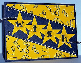
stamps: but I need it (
Hanna Stamps), bold line alpha lower (SU retired)
ink: jet black stazon
paper: basic black, summer sun
other: large star punch, page pebbles, ribbon, white gel pen, brads
The next challenge was to have fuzzy things on your card. I used velveteen paper and felt flowers. The clothesline poles are made from toothpicks that I cut the pointy ends off.

stamps: but I need it (
Hanna Stamps)
ink: jet black stazon
paper: basic black, gable green, print pack, velveteen (yellow, blue, pink)
other: felt fusion, toothpicks, brad
The fourth challenge was to use at least two punches on your card. I used a plain circle, a scalloped circle and a flower punch.

stamps: but I need it (
Hanna Stamps)
ink: adirondack pitch black
paper: basic black, real red, GP white
other: copic markers, red grosgrain ribbon, 1-3/8" circle punch, scalloped circle punch, flower punch (EK success), rhinestones
And the final challenge was to be inspired by some flannel pajamas. Since the weather we've been having certainly doesn't call for flannel pj's, I created a template for a summer nightie. This card has no stamping on it. The lace is sewn on.

stamps: none
ink: none
paper: white, dp (stack ??)
other: ruffled lace, sewing machine, thread, buttons, crochet cotton
I'm so glad you stopped by. I will post the cards from the Gina K challenges in another post.

 I have a small class this week and this is one of the cards we will do. I can't remember who explained this technique, but it was one of those light bulb moments for me. I stamped the image on watercolor paper with stazon ink. Then I used my SU markers to highlight basically only the areas that are already shaded on the image. Then use an aqua painter to pull the color and spread it around on the image. Depending on how much ink you laid down originally, your image can be very light or very vivid. The rest of the card is pretty simple -- adding some sponging, ribbon and glitter.