Hi my friends. How about another page spread from my word play journal? To see all the completed pages, click here. There's a challenge in the OWSE Yahoo group for the month of August, to create something that refers to what we did this summer. So, I'm cutting it pretty close to the deadline, which is tomorrow.
I have what I refer to as my garden. What it really consists of is four large half-barrels, in which I planted tomatoes. This is my third year, and what I would consider my first successful one. The last two years apparently were not good ones for growing tomatoes, because I got very little produce from any of the plants. But this year I'm happy with how many tomatoes I'm getting. And the best part -- they are soooo yummy.
So I made my page spread about a garden. I have a number of the new Prima mixed media dolls by Julie Nutting, but I didn't think their dressy/flirty style fit with my garden theme, so I decided to try a 'she art' doll. This is my first attempt, and I'm happy with it. I used an old book page and designer paper. The dress is also stamped with flowers. After cutting out the hat, I cut a slit to fit her head into.
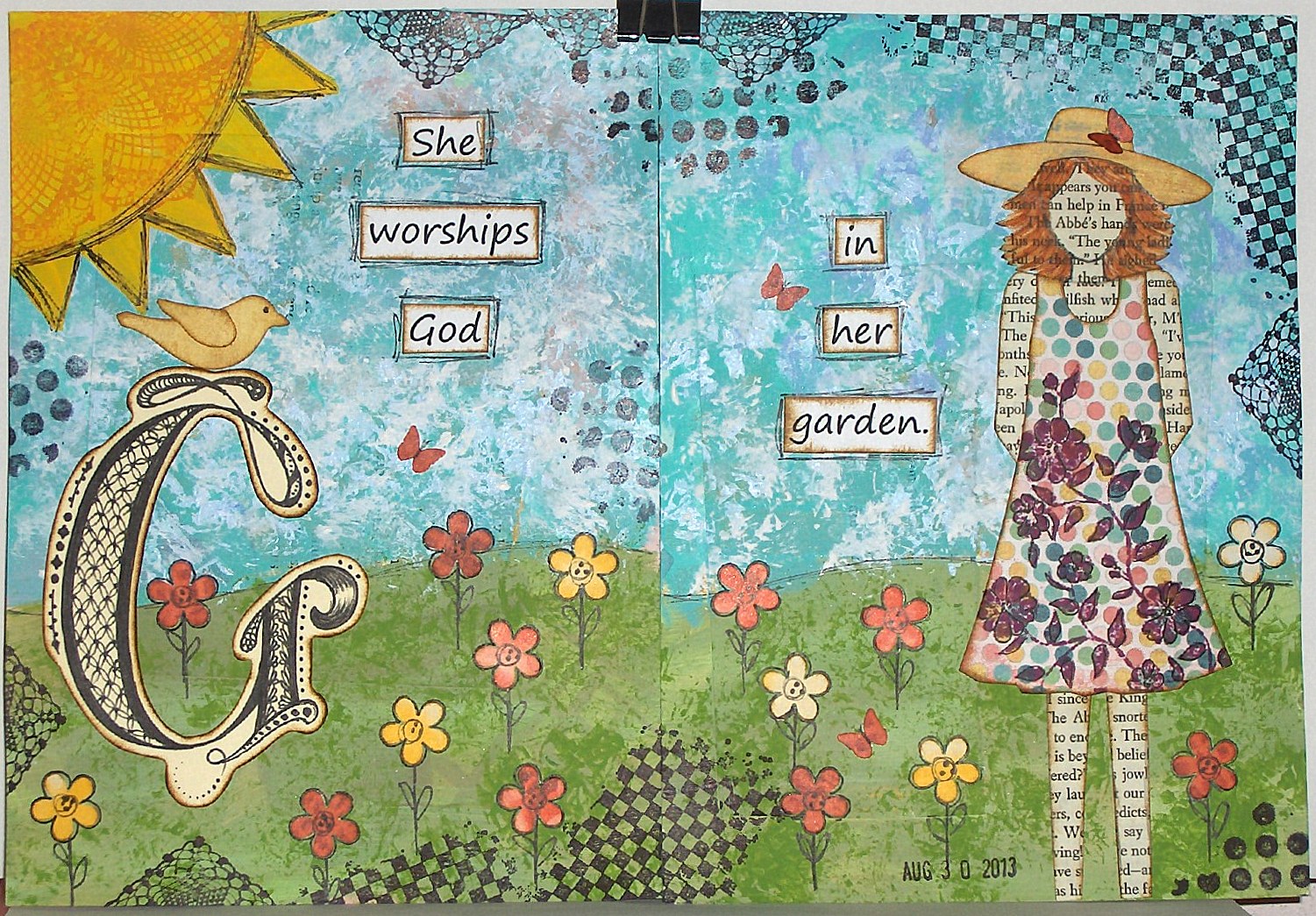
When I started this journal, I created the base for each page right at the beginning, but for this page, I covered it all up with paint, since it just didn't match my theme.
To get the texture in the sky, I pounced a stencil brush and gesso over the blue paint.
The sun is painted, outlined and stamped with a doily stamp. The flowers are punched and outlined. The stems and leaves are hand drawn.
The 'G' is hand drawn and zentangled. The sentiment is computer generated. The bird is cut with a Sizzix die and the butterflies are punched with a Martha Stewart punch. Most of the pieces on this spread have been edged with vintage photo distress ink.
I also did some random stamping with a Gina K. stamp and Tim Holtz stamps.
Thank you so much for stopping by today. I hope you have a wonderful weekend.
Showing posts with label art journal. Show all posts
Friday, August 30, 2013
word play - g
Labels:
acrylic paint,
art journal,
cuttlebug,
gesso,
Gina K Designs,
mixed media,
OWSE,
Sizzix,
Tim Holtz,
word play
Saturday, August 24, 2013
word play - F
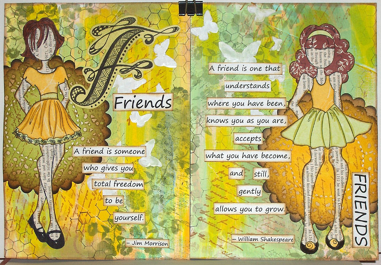
Hi friends. Another spread in my word play journal. I told my daughter that this was my 'F' word, and she just snickered. But no bad language here. My word for the letter F is friends. You can find all the completed pages here.
I wanted to make something for the weekly challenge on the OWSE facebook page, I decided to to make another spread for this journal. There were some choices for colors, and I chose green and yellow. This is really not one of my favorite color combinations, but I guess I need to step out of my box once in awhile.
Although the background of the pages was done previously, I added more color with both paint and ink. Then I did a bunch of stamping and added some texture with modeling paste and a butterfly stencil (Red Lead). In a couple of places, the ink underneath bled through the modeling paste, so I went over that with white acrylic paint. It didn't completely cover, but I thought it wasn't too noticeable, since the background is pretty busy anyway, and I was going to cover up a lot of it with the dolls and the words.
I used two of my new Prima mixed media dolls by Julie Nutting. I have a hard time remembering the names. I first glued a page from an old encyclopedia onto a piece of this card stock and then stamped the dolls on that and cut them out. I paper pieced the clothes and the hair on one.
Behind the dolls are die cuts of a French pastry doily die (Cheery Lynn Designs) and a Sizzix scalloped circle.
The words were printed on my computer and cut out. The edges on everything are sponged with vintage photo distress ink. The letter F is done with zentangles or zendoodles, whichever you want to call it.
Thanks so much for stopping by.
I wanted to make something for the weekly challenge on the OWSE facebook page, I decided to to make another spread for this journal. There were some choices for colors, and I chose green and yellow. This is really not one of my favorite color combinations, but I guess I need to step out of my box once in awhile.
Although the background of the pages was done previously, I added more color with both paint and ink. Then I did a bunch of stamping and added some texture with modeling paste and a butterfly stencil (Red Lead). In a couple of places, the ink underneath bled through the modeling paste, so I went over that with white acrylic paint. It didn't completely cover, but I thought it wasn't too noticeable, since the background is pretty busy anyway, and I was going to cover up a lot of it with the dolls and the words.
I used two of my new Prima mixed media dolls by Julie Nutting. I have a hard time remembering the names. I first glued a page from an old encyclopedia onto a piece of this card stock and then stamped the dolls on that and cut them out. I paper pieced the clothes and the hair on one.
Behind the dolls are die cuts of a French pastry doily die (Cheery Lynn Designs) and a Sizzix scalloped circle.
The words were printed on my computer and cut out. The edges on everything are sponged with vintage photo distress ink. The letter F is done with zentangles or zendoodles, whichever you want to call it.
Thanks so much for stopping by.
Labels:
acrylic paint,
art journal,
Cheery Lynn Designs,
cuttlebug,
gesso,
OWSE,
paint,
paper dolls,
paper piecing,
Prima,
Sizzix,
stencil,
word play,
zentangle
Saturday, July 20, 2013
save the last dance
Hi friends. Tonight, Robyn posted a challenge on our facebook group page to post a completed project. I had been coloring a couple of the Prima mixed media dolls with derwent inktense pencils, so I put together a quick journal page.
I started with a layer of gesso, then used some distress paints by putting them on my craft sheet, spritzing with water and dragging the page through them. After drying them, I added some dylusions spray inks using a stencil made from a sizzix die and a butterfly stencil from red lead.
I used a couple of old SU music sets to stamp randomly with jet black archival ink.
The girl is made using two mixed media dolls (swing dress & doll with strapless dress). I cut the skirt portion from one and added it to the other, so her dress was longer. I cut around the bottom of the bow and tucked the longer skirt underneath. I needed to trim the sides of the original skirt, so that it didn't extend beyond the edges of the new skirt.
The sentiment was typed up on my computer and printed.
Thanks so much for visiting today.
I started with a layer of gesso, then used some distress paints by putting them on my craft sheet, spritzing with water and dragging the page through them. After drying them, I added some dylusions spray inks using a stencil made from a sizzix die and a butterfly stencil from red lead.
I used a couple of old SU music sets to stamp randomly with jet black archival ink.
The girl is made using two mixed media dolls (swing dress & doll with strapless dress). I cut the skirt portion from one and added it to the other, so her dress was longer. I cut around the bottom of the bow and tucked the longer skirt underneath. I needed to trim the sides of the original skirt, so that it didn't extend beyond the edges of the new skirt.
The sentiment was typed up on my computer and printed.
Thanks so much for visiting today.
Labels:
art journal,
distress paint,
mixed media,
OWSE,
paint,
Sizzix,
stencil,
SU,
Tim Holtz
Wednesday, July 3, 2013
life is good
Hi friends. Happy Independence Day to all my friends in the USA!
I recently joined another facebook group - this one about art journaling. There are lots of prompts and challenges. It's been some time since I've really done any pages, so I thought this would be a good opportunity to jump back in. The first challenge was to use two colors of paint, gesso, and some designer paper or old book pages, or some such.
I normally start all my pages with a coat of gesso, but simply forgot to do that on this one.
I dripped some paint on the page and then used an old plastic gift card to drag the paint across the page. I used two different colors separately.
Then I used a crafter's workshop stencil, mini echoes, and painted gesso through the stencil. I didn't care for the darker color. It was much too bold, so I then used a gesso wash and painted over the entire page. That was much better.
I wanted to use one of the new Julie Nutting mixed media doll stamps, so I stamped the doll with ruffles with jet black archival ink and colored it with inktense pencils and a water brush. Then I cut it out.
I cut some strips of pattern paper that matched the colors on the dress. I cut the scallops freehand and layered the paper on the edges.
I pulled out an old flower stamp that I've had for years and never used (really?) and stamped it randomly over the background in purely pomegranate ink and bermuda bay ink.
Next I attached the doll.
The final step was printing a sentiment, cutting apart some of the words, sponging around the edges, and gluing them down. I'm happy with my page.
Thank you so much for stopping by.
I recently joined another facebook group - this one about art journaling. There are lots of prompts and challenges. It's been some time since I've really done any pages, so I thought this would be a good opportunity to jump back in. The first challenge was to use two colors of paint, gesso, and some designer paper or old book pages, or some such.
I normally start all my pages with a coat of gesso, but simply forgot to do that on this one.
I dripped some paint on the page and then used an old plastic gift card to drag the paint across the page. I used two different colors separately.
Then I used a crafter's workshop stencil, mini echoes, and painted gesso through the stencil. I didn't care for the darker color. It was much too bold, so I then used a gesso wash and painted over the entire page. That was much better.
I wanted to use one of the new Julie Nutting mixed media doll stamps, so I stamped the doll with ruffles with jet black archival ink and colored it with inktense pencils and a water brush. Then I cut it out.
I cut some strips of pattern paper that matched the colors on the dress. I cut the scallops freehand and layered the paper on the edges.
I pulled out an old flower stamp that I've had for years and never used (really?) and stamped it randomly over the background in purely pomegranate ink and bermuda bay ink.
Next I attached the doll.
The final step was printing a sentiment, cutting apart some of the words, sponging around the edges, and gluing them down. I'm happy with my page.
Thank you so much for stopping by.
Labels:
acrylic paint,
art journal,
gesso,
mixed media,
stencil
Friday, June 14, 2013
moonflowers
Hello friends. A couple of days ago, a challenge was issued in one of the facebook groups that I'm in. The challenge was to create something inspired by the following quote: "When the earth smelled of summer and the sky was filled with night..."
I wanted to find out where the quote was from, so I did a google search and came up with the following:
Hello Young Lovers (from the King and I)
Anna,
when I think of Tom
I
think about a night
When
the earth smelled of summer
And
the sky was streaked with white
And
the soft mist of England
Was
sleeping on a hill
I
remember this
And
I always will
There
are new lovers now on the same silent hill
Looking
on the same blue sea
And
I know Tom and I are a part of them all
And
they're all a part of Tom and me
Hello
young lovers, whoever you are
I
hope your troubles are few
All
my good wishes go with you tonight
I've
been in love like you
Be
brave young lovers and follow your star
Be
brave and faithful and true
Cling
very close to each other tonight
I've
been in love like you
I
know how it feels to have wings on your heels
And
to fly down the street in a trance
You
fly down a street on a chance that you'll meet
And
you meet – not really by chance
Don't
cry young lovers, whatever you do
Don't
cry because I'm alone
All
of my memories are happy tonight
I've
had a love of my own
I've
had a love of my own like yours
I've
had a love of my own
The line was unintentionally misquoted, but it worked anyway for a great challenge. The first thing that came to mind was moonflowers. Although I've never actually seen a moonflower, I knew that I could find images online. My flowers don't look exactly like moonflowers, but since this is art, it doesn't matter.
It has been a long time since I've done an art journal page, so I pulled out a journal page that I had done the background on months ago and decided to use it.
I added some leaves with green acrylic paint using one of the stencils that I made recently.
Then I stamped some flowers from a SU set called Secret Garden. I sponged the centers with light green ink and added some dots of white acrylic paint with a toothpick that I cut the point off of. I glued on the flowers and added the sentiment, which I printed on the computer.
Thanks so much for stopping by.
Labels:
acrylic paint,
art journal,
gesso,
mixed media,
OWSE,
recycle/reuse,
SU
Sunday, April 28, 2013
bell flowers
Hi friends. I think maybe my mojo is sneaking back. I sat down to create this morning and it happened!
Robyn over at OWSE Yahoo group presented us with a quick fire challenge this morning to create something with either birds or bees. I decided to make another page to go in the journal I started in January (21 cards) for Motley Soul Mixed Media Art.
The page is 4"x6" made from cereal box chipboard, covered with coffee filters, gesso and paint. The background was already done, and I chose to just work with it as is.
I found the chipboard vine (Sizzix) in my stash and covered it with vintage photo distress ink.
Then I die cut a bunch of the tiniest flower on the tattered florals die (Tim Holtz) from a blue card stock and sponged the petals with seedless preserves distress ink. I snipped into the center between two of the petals and then used a stylus and my fingers to form the flowers into a bell shape. I glued them onto the vine and added some highlights on the petals with a white gel pen. A black sharpie was used to make the stamen. The flowers look really flat in the photo, but they are actually very dimensional and stand out about 1/4" from the page.
The bird from caged bird (Tim Holtz) was die cut from the same blue card stock, embossed with tiny mosaic embossing folder and sponged with seedless preserves. I attached the bird with dimensional tape.
The sentiment was hand written with a sharpie marker.
I'm also entering this in the mix-ability challenge #13 and the free for all challenge #166 on SCS.
Thanks so much for stopping by. Have a great week.
Robyn over at OWSE Yahoo group presented us with a quick fire challenge this morning to create something with either birds or bees. I decided to make another page to go in the journal I started in January (21 cards) for Motley Soul Mixed Media Art.
The page is 4"x6" made from cereal box chipboard, covered with coffee filters, gesso and paint. The background was already done, and I chose to just work with it as is.
I found the chipboard vine (Sizzix) in my stash and covered it with vintage photo distress ink.
Then I die cut a bunch of the tiniest flower on the tattered florals die (Tim Holtz) from a blue card stock and sponged the petals with seedless preserves distress ink. I snipped into the center between two of the petals and then used a stylus and my fingers to form the flowers into a bell shape. I glued them onto the vine and added some highlights on the petals with a white gel pen. A black sharpie was used to make the stamen. The flowers look really flat in the photo, but they are actually very dimensional and stand out about 1/4" from the page.
The bird from caged bird (Tim Holtz) was die cut from the same blue card stock, embossed with tiny mosaic embossing folder and sponged with seedless preserves. I attached the bird with dimensional tape.
The sentiment was hand written with a sharpie marker.
I'm also entering this in the mix-ability challenge #13 and the free for all challenge #166 on SCS.
Thanks so much for stopping by. Have a great week.
Monday, March 18, 2013
word play - E
Hello friends. Wow! I can't believe it's been almost a year since I did a spread in my word play journal. With just 26 letters, I thought I'd have the entire journal completed in a year. Grand intentions, I guess. Click here to see the previous pages. Since I made the base pages all at once, I don't even remember how I did that. I'm pretty sure they are watercolor paper with old book pages, stencils and paint.
This spread was put together over several days. I wanted some texture, so I used light spackling compound with a circle template and palette knife, and then I just spread some on without a stencil.
I used several stencils (crafter's workshop & red lead), acrylic paint, ink, and water soluble wax pastels. I used a sponge to pounce either the paint or ink through my stencils. I also used a black sharpie to outline some of the stenciled images.
The letter 'E' is hand drawn and zentangled. The title and verse are computer generated.
As part of the mix-ability challenge on SCS, I added some paint splatters. The Bible verse makes this eligible for the Divine Design Bible Verse Challenge 2013.
Thank you so much for stopping by for a visit.
This spread was put together over several days. I wanted some texture, so I used light spackling compound with a circle template and palette knife, and then I just spread some on without a stencil.
I used several stencils (crafter's workshop & red lead), acrylic paint, ink, and water soluble wax pastels. I used a sponge to pounce either the paint or ink through my stencils. I also used a black sharpie to outline some of the stenciled images.
The letter 'E' is hand drawn and zentangled. The title and verse are computer generated.
As part of the mix-ability challenge on SCS, I added some paint splatters. The Bible verse makes this eligible for the Divine Design Bible Verse Challenge 2013.
Thank you so much for stopping by for a visit.
Friday, March 8, 2013
21 cards - #34
Hello friends. You would think I can't count! LOL The numbers just don't seem to correlate because the 21 cards have TWO sides. I think that means I have four more cards, but both sides, to go. But, I know that I remade one, so my total will be 43 instead of 42. Are you totally confused yet?
These are pages I'm making, which started as a challenge in January at Motley Soul Mixed-Media Art. I was one of the winners of a handmade book by Mika, and it came in the mail today. Very, very cool. I'm not sure what I'll put in it yet. Maybe I'll just sit and admire all her wonderful pages. By clicking on the link above, you can see some of them that she has made. This is my Friday Feature on the OWSE blog.
I decided to double up on this card, so I used the mix-ability challenge today on SCS for a start to my page. I started with my base (made previously) of cereal box chipboard, covered with reused coffee filters and coated with gesso. Then I tore some newspaper and glued it on with matte Mod Podge. When that was dry, I brushed some gesso over it.
I was being impatient, so I used my heat gun a lot to dry each layer.
Next I used some distress ink sprays, made with reinkers and water, and sprayed my page. I used mustard seed, barn door, and faded jeans. Some I blotted away with paper towel.
Next I did some stamping with Nature's Moments (Tim Holtz/Stamper's Anonymous). Flowers were colored with distress markers and stains, and the bird and sentiment were stamped with jet black archival.
I added some washi/tissue tape from Tim Holtz & 7 Gypsies, as well as some that I made myself with coffee filters and scor-tape. A couple of them were brighter than I wanted, so I rubbed some gesso wash over them with my finger.
Finally, I added a couple of black mini flourishes (Sizzix), but I again decided there was too much contrast, so I blotted some more gesso wash over the flourishes with a cotton ball.
Thanks so much for stopping by.
These are pages I'm making, which started as a challenge in January at Motley Soul Mixed-Media Art. I was one of the winners of a handmade book by Mika, and it came in the mail today. Very, very cool. I'm not sure what I'll put in it yet. Maybe I'll just sit and admire all her wonderful pages. By clicking on the link above, you can see some of them that she has made. This is my Friday Feature on the OWSE blog.
I decided to double up on this card, so I used the mix-ability challenge today on SCS for a start to my page. I started with my base (made previously) of cereal box chipboard, covered with reused coffee filters and coated with gesso. Then I tore some newspaper and glued it on with matte Mod Podge. When that was dry, I brushed some gesso over it.
I was being impatient, so I used my heat gun a lot to dry each layer.
Next I used some distress ink sprays, made with reinkers and water, and sprayed my page. I used mustard seed, barn door, and faded jeans. Some I blotted away with paper towel.
Next I did some stamping with Nature's Moments (Tim Holtz/Stamper's Anonymous). Flowers were colored with distress markers and stains, and the bird and sentiment were stamped with jet black archival.
I added some washi/tissue tape from Tim Holtz & 7 Gypsies, as well as some that I made myself with coffee filters and scor-tape. A couple of them were brighter than I wanted, so I rubbed some gesso wash over them with my finger.
Finally, I added a couple of black mini flourishes (Sizzix), but I again decided there was too much contrast, so I blotted some more gesso wash over the flourishes with a cotton ball.
Thanks so much for stopping by.
Saturday, February 2, 2013
21 cards - #31 and a new challenge
Happy Saturday, friends. Yesterday was the first day for the NEW Mix-Ability challenge on Splitcoaststampers, all about mixed media. Yay! I know I'm going to love it.
The first challenge is Yin Yang. So I used this challenge to create another card for January's monthly challenge at Motley Soul Mixed-Media Art. There is a new challenge for February, but I haven't started on that one yet. It's all hearts - need to think on that for a bit.
This post shows how I made the base for my cards with cereal box chipboard and coffee filters.
I started by painting my base with celery green acrylic paint. Then I used a butterfly stencil, the solid part sponged with gesso, and the detailed part sponged with pearl turquoise and pearl blue lumiere paints for a bit of shimmer. I also outlined the butterfly with a Pitt pen. Since the body of the butterfly was white, I cut a new one from black card stock and glued that on.
Nothing like going backwards, but then I decided to add some stamping to the background, so I carefully added some texture type images from Donna Salazar and Tim Holtz in jet black archival ink.
While playing around with some additions, but not sure what to add, I decided to leave it overnight and look at it again this morning. I knew right away that I wanted to change up the background some more, so I applied some buttermilk acrylic paint with my finger, so it just brings out the texture of the coffee filter without covering up the stamping.
Then I added bits of torn card stock and pattern paper.
The sentiment is from Nostalgics Attic Collection (Image Tree), punched out with a 1/2" circle punch and raised on dimensionals.
Then I attached a piece of burlap, some raffia, a hand crocheted flower and a button.
I love it! How can I not? It has lots of texture and lots of BLUE! LOL
Thanks so much for spending some time with me today. Enjoy your weekend.
The first challenge is Yin Yang. So I used this challenge to create another card for January's monthly challenge at Motley Soul Mixed-Media Art. There is a new challenge for February, but I haven't started on that one yet. It's all hearts - need to think on that for a bit.
This post shows how I made the base for my cards with cereal box chipboard and coffee filters.
I started by painting my base with celery green acrylic paint. Then I used a butterfly stencil, the solid part sponged with gesso, and the detailed part sponged with pearl turquoise and pearl blue lumiere paints for a bit of shimmer. I also outlined the butterfly with a Pitt pen. Since the body of the butterfly was white, I cut a new one from black card stock and glued that on.
Nothing like going backwards, but then I decided to add some stamping to the background, so I carefully added some texture type images from Donna Salazar and Tim Holtz in jet black archival ink.
While playing around with some additions, but not sure what to add, I decided to leave it overnight and look at it again this morning. I knew right away that I wanted to change up the background some more, so I applied some buttermilk acrylic paint with my finger, so it just brings out the texture of the coffee filter without covering up the stamping.
Then I added bits of torn card stock and pattern paper.
The sentiment is from Nostalgics Attic Collection (Image Tree), punched out with a 1/2" circle punch and raised on dimensionals.
Then I attached a piece of burlap, some raffia, a hand crocheted flower and a button.
I love it! How can I not? It has lots of texture and lots of BLUE! LOL
Thanks so much for spending some time with me today. Enjoy your weekend.
Labels:
21 cards,
acrylic paint,
art journal,
crochet,
fabric,
gesso,
mixed media,
Motley Soul,
paint,
recycle/reuse,
stencil,
Tim Holtz
Thursday, October 18, 2012
snowflakes
Oooo, I'm not ready for that yet, are you?
Hello, my friends. The idea for this art journal spread came from a challenge by Julie and Nathalie called Take the Second Floor Challenge, which is a challenge to push yourself out of your box. This time the challenge is to use white card stock.
My pages were painted in some colors I didn't like, so I went over them with gesso, white acrylic paint and more gesso. After all of that, you would think they would be white - but not so. So I just used a sponge with bashful blue ink and added some blue. Not too much, though, because I wanted to keep the background pretty white.
Then I used white card stock and die cut a bunch of snowflakes with three different sets of Spellbinders dies, which I've had for a long time and not used any of them before. It was time for them to see some action. I also embossed and sponged them with bashful blue ink, so they would stand out a little from the background.
It was hard to not add more color, since I usually like something that will really pop on the page.
I searched online for a quote pertaining to snow and finally found one I liked, so I printed it out and added it to my spread.
This is a really different spread for me with so little color. I don't like how the snowflakes blend into the background. Thanks so much for stopping by.
Hello, my friends. The idea for this art journal spread came from a challenge by Julie and Nathalie called Take the Second Floor Challenge, which is a challenge to push yourself out of your box. This time the challenge is to use white card stock.
My pages were painted in some colors I didn't like, so I went over them with gesso, white acrylic paint and more gesso. After all of that, you would think they would be white - but not so. So I just used a sponge with bashful blue ink and added some blue. Not too much, though, because I wanted to keep the background pretty white.
Then I used white card stock and die cut a bunch of snowflakes with three different sets of Spellbinders dies, which I've had for a long time and not used any of them before. It was time for them to see some action. I also embossed and sponged them with bashful blue ink, so they would stand out a little from the background.
It was hard to not add more color, since I usually like something that will really pop on the page.
I searched online for a quote pertaining to snow and finally found one I liked, so I printed it out and added it to my spread.
This is a really different spread for me with so little color. I don't like how the snowflakes blend into the background. Thanks so much for stopping by.
Labels:
2nd floor challenge,
acrylic paint,
art journal,
cuttlebug,
gesso,
Spellbinders
Sunday, October 14, 2012
autumn leaves
Hello, my friends. Somehow, while I've been in a creative slump, time has slipped by, and I realized that I had completely missed doing the Bible verse challenge on SCS for the month of September. That also means I need to do an extra one to get caught up for October.
Still not feeling too creative, today I forced myself to pull out a couple of art journal pages and see what I could do. I'm happy to say that I was able to create a journal spread, so this is for the September challenge.
These pages were already painted, but I wasn't happy with what they looked like, so I coated over them with gesso (love that stuff). I didn't cover everything completely, but didn't concern myself, because I was going to add some inks, stamping and die cuts.
I used some distress stains in fall colors randomly around the pages and then brushed a gesso wash over that, toning down the colors and blending them a bit, but not covering them completely.
I then stamped some random images all over the background, again using fall ink colors.
The leaves are die cut using my new SU autumn accents die and then I stamped a different background on each one and sponged the edges with chocolate chip ink.
The Bible verse is printed on my computer.
Thanks so much for stopping by today.
Still not feeling too creative, today I forced myself to pull out a couple of art journal pages and see what I could do. I'm happy to say that I was able to create a journal spread, so this is for the September challenge.
These pages were already painted, but I wasn't happy with what they looked like, so I coated over them with gesso (love that stuff). I didn't cover everything completely, but didn't concern myself, because I was going to add some inks, stamping and die cuts.
I used some distress stains in fall colors randomly around the pages and then brushed a gesso wash over that, toning down the colors and blending them a bit, but not covering them completely.
I then stamped some random images all over the background, again using fall ink colors.
The leaves are die cut using my new SU autumn accents die and then I stamped a different background on each one and sponged the edges with chocolate chip ink.
The Bible verse is printed on my computer.
Thanks so much for stopping by today.
Labels:
art journal,
Bible verse,
cuttlebug,
gesso,
Hero Arts,
Rubbernecker,
SU
Sunday, August 19, 2012
serendipity
Hello, my friends. We've been having some wonderful weather here. Cool in the morning (around 50) and in the low 70's during the day. This is my kind of weather.
Today I have an art journal page that I made for a challenge at OWSE Yahoo group. The technique is serendipity.
I started with some old book pages, which I covered with gesso. The idea is to make several backgrounds, using ink, paint, stamps, etc. So I used a number of brilliance inks to sponge on color, somewhat randomly. I added quite a bit of stamping, mostly with black archival ink, but I also used some color.
The next step is to cut up your backgrounds into strips, or squares, or other shapes that you can fit back together on your page, but randomly, so that the pieces are all mixed up, making a completely new background. I cut mine into 1"x3" pieces and then placed them down in a pattern like a quilt. Now I like color, but I thought my page was way too bright, so I went over it with a gesso wash, toning down the brightness more to my liking.
I wanted to add something very subtle to bring it all together, so I took a Dylusions stencil and sponged on turquoise ink, and used a black marker to add some highlights. Using a different part of the same stencil, I sponged black paint over the leaves for a bold accent to balance out the oval frame on the main image.
For my main image, I colored a Penny Black flower with markers, huffed on it and stamped it on white card stock twice. I then die cut that with a mega ovals spellbinders die in my cuttlebug. I also cut a black scallop oval to frame it. I sponged the edge with vintage photo distress ink.
At the moment, I waiting for a new computer to arrive, so I'll have printer access again. In the mean time, I found a sentiment that I had printed previously that I thought would work well on this page. Serendipity?
Thanks so much for stopping by today. Have a wonderful week.
Today I have an art journal page that I made for a challenge at OWSE Yahoo group. The technique is serendipity.
I started with some old book pages, which I covered with gesso. The idea is to make several backgrounds, using ink, paint, stamps, etc. So I used a number of brilliance inks to sponge on color, somewhat randomly. I added quite a bit of stamping, mostly with black archival ink, but I also used some color.
The next step is to cut up your backgrounds into strips, or squares, or other shapes that you can fit back together on your page, but randomly, so that the pieces are all mixed up, making a completely new background. I cut mine into 1"x3" pieces and then placed them down in a pattern like a quilt. Now I like color, but I thought my page was way too bright, so I went over it with a gesso wash, toning down the brightness more to my liking.
I wanted to add something very subtle to bring it all together, so I took a Dylusions stencil and sponged on turquoise ink, and used a black marker to add some highlights. Using a different part of the same stencil, I sponged black paint over the leaves for a bold accent to balance out the oval frame on the main image.
For my main image, I colored a Penny Black flower with markers, huffed on it and stamped it on white card stock twice. I then die cut that with a mega ovals spellbinders die in my cuttlebug. I also cut a black scallop oval to frame it. I sponged the edge with vintage photo distress ink.
At the moment, I waiting for a new computer to arrive, so I'll have printer access again. In the mean time, I found a sentiment that I had printed previously that I thought would work well on this page. Serendipity?
Thanks so much for stopping by today. Have a wonderful week.
Labels:
acrylic paint,
art journal,
cuttlebug,
gesso,
Hero Arts,
OWSE,
Penny Black,
Spellbinders,
stencil,
technique challenge,
Tim Holtz
Sunday, August 12, 2012
waterlilies
Hello, my friends. It's been wonderful having a few days that are cool enough not to need the A/C on. But I think it's supposed to get hot again this week. I'm also starting to get a few ripe tomatoes from the plants on my patio. They taste soooo much better than the ones you get at the grocery store.
This week I've been working on a challenge for OWSE Yahoo group art journal club. It's a background made using thick gesso and an embossing folder. Since I don't have any thick gesso, I decided to make some. I found several recipes on line, so I sort of ad libbed and mixed up some white glue, baby powder, water and white acrylic paint until I had a pretty thick solution. Then I spread some on my page and pressed my embossing folder into it. When I lifted the folder off, I could tell that my solution wasn't really thick enough. I scraped some of it off, let it set for a couple of minutes and then did the embossing folder thing again. Although it was better, I still wasn't completely satisfied with the result. I was really hoping the pattern of the embossing folder would show more, but there was only a slight resemblance. So for the facing page, I decided to use Spackle instead. The result was similar to my homemade gesso, even though the Spackle was a better consistency for the technique.
I let the pages dry and then sanded over some of the rougher areas, and then painted the pages with a very watered down blue acrylic paint. The next step was adding some distress ink with a sponge. I used faded jeans and chipped sapphire.
The next step was to use some ink spray on an embossing folder and then use it like a stamp, pressing it on the page. This part didn't work at all, since I had so much texture, there really wasn't enough solid surface to pick up the ink. I only got a few little spots where the ink showed.
I thought the pages looked so much like water, I decided to follow through on that theme and made some waterlilies and lily pads. I made a pattern for the leaves and cut them from wild wasabi card stock and then sponged the edges with always artichoke and purely pomegranate ink. I used a stylus to make a center vein on each leaf.
The lilies are made with a 6 petal flower punch. I sponged the centers of each white flower with pink passion ink and then used a stylus to make the flowers curl. I stacked five for each lily. For the centers, I punched some yoyo yellow with another flower punch. I trimmed off the tips of the petals on one and left the other, using two for each of the flowers. I sponged the edges with pink passion and then glued each flower all together.
I decided to use this spread for my August Divine Design Bible Verse challenge on SCS, so I chose Psalm 51: 10 as my verse. Because my computer died about a week ago, I'm temporarily using DH's extra laptop, which doesn't have all the programs I usually use, so instead of printing out my verse, I hand printed it (about five times, since I messed it up a few times). I finally managed to get one that looked OK. I sponged the edges with artichoke ink and then glue it down. I really love how this spread turned out.
Thanks so much for stopping by. Have a wonderful week.
This week I've been working on a challenge for OWSE Yahoo group art journal club. It's a background made using thick gesso and an embossing folder. Since I don't have any thick gesso, I decided to make some. I found several recipes on line, so I sort of ad libbed and mixed up some white glue, baby powder, water and white acrylic paint until I had a pretty thick solution. Then I spread some on my page and pressed my embossing folder into it. When I lifted the folder off, I could tell that my solution wasn't really thick enough. I scraped some of it off, let it set for a couple of minutes and then did the embossing folder thing again. Although it was better, I still wasn't completely satisfied with the result. I was really hoping the pattern of the embossing folder would show more, but there was only a slight resemblance. So for the facing page, I decided to use Spackle instead. The result was similar to my homemade gesso, even though the Spackle was a better consistency for the technique.
I let the pages dry and then sanded over some of the rougher areas, and then painted the pages with a very watered down blue acrylic paint. The next step was adding some distress ink with a sponge. I used faded jeans and chipped sapphire.
The next step was to use some ink spray on an embossing folder and then use it like a stamp, pressing it on the page. This part didn't work at all, since I had so much texture, there really wasn't enough solid surface to pick up the ink. I only got a few little spots where the ink showed.
I thought the pages looked so much like water, I decided to follow through on that theme and made some waterlilies and lily pads. I made a pattern for the leaves and cut them from wild wasabi card stock and then sponged the edges with always artichoke and purely pomegranate ink. I used a stylus to make a center vein on each leaf.
The lilies are made with a 6 petal flower punch. I sponged the centers of each white flower with pink passion ink and then used a stylus to make the flowers curl. I stacked five for each lily. For the centers, I punched some yoyo yellow with another flower punch. I trimmed off the tips of the petals on one and left the other, using two for each of the flowers. I sponged the edges with pink passion and then glued each flower all together.
I decided to use this spread for my August Divine Design Bible Verse challenge on SCS, so I chose Psalm 51: 10 as my verse. Because my computer died about a week ago, I'm temporarily using DH's extra laptop, which doesn't have all the programs I usually use, so instead of printing out my verse, I hand printed it (about five times, since I messed it up a few times). I finally managed to get one that looked OK. I sponged the edges with artichoke ink and then glue it down. I really love how this spread turned out.
Thanks so much for stopping by. Have a wonderful week.
Labels:
acrylic paint,
art journal,
Bible verse,
gesso,
OWSE,
special techniques
Saturday, July 28, 2012
balance
Happy Saturday, my friends. We received a few good drenching rain showers this week, so our lawn is looking a little less brown. I heard some lawn mowers out this morning, including ours.
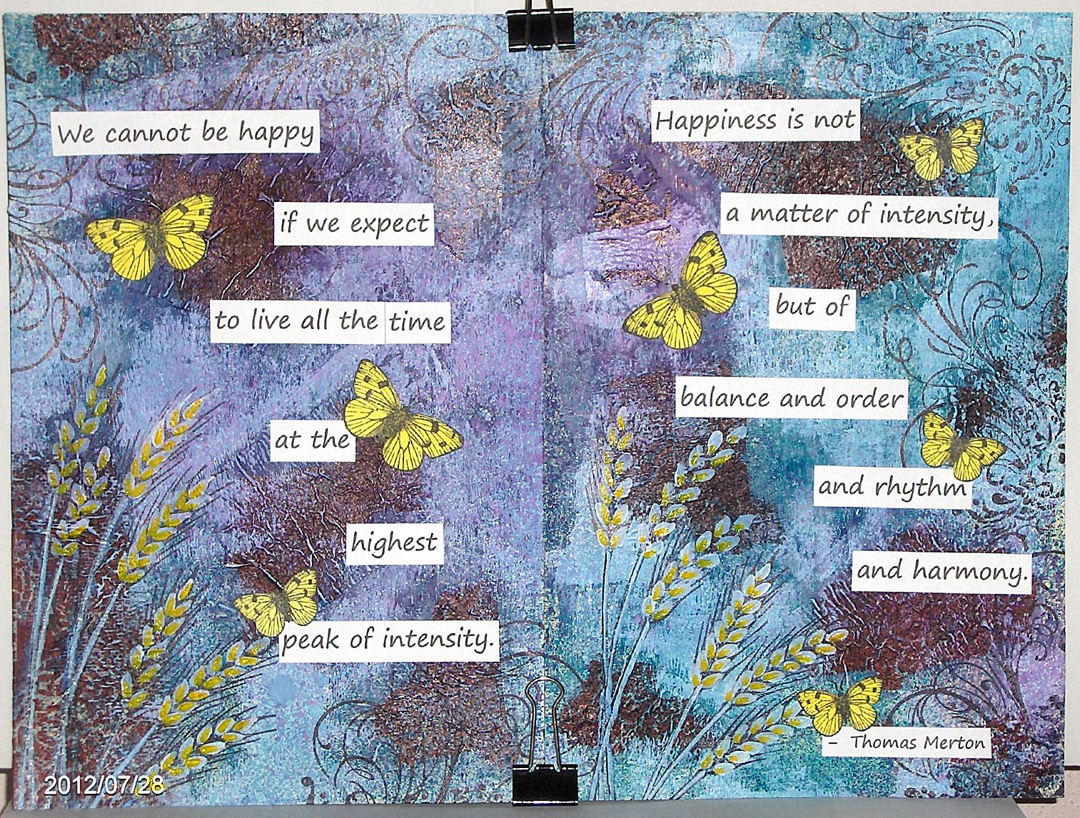
I made another art journal spread for a technique at OWSE Yahoo group. This one is a paper napkin technique. We were supposed to start with a colorful printed napkin, but the only one I could find was a dark rust with a creamy pattern on it. Rather than go out shopping, I decided to use it.
I stamped the napkin with several background type stamps in black archival ink and then tore the napkin into pieces and glued them to my pages with matte Mod Podge. The next step was to paint around the pieces with a neutral color paint; I used off white.
Then I sprayed the pages with ink sprays - blue, turquoise, and purple. To blot the ink, I rolled paper towel over the pages. Then I heat set the ink to dry it.
Once the ink was dry, I lightly brayered white paint on the pages, again leaving the napkin pieces visible. The ink colored my paint, so it's no longer white, making it a lot darker than I had planned.
Again using black archival ink, I stamped some images on the pages - wheat (Judikins) and flourish (Inkadinkado). I wanted more color, so I painted the wheat kernels with gesso and then used a yellow marker to add some color.
I typed up the sentiment on my computer and printed it, cut it apart and attached it to my pages. At this point, I still wanted more color, so I stamped some Hero Art butterflies, colored them with a copic marker and cut them out.
And there you have it. Thanks so much for stopping by. Have a great weekend.
I made another art journal spread for a technique at OWSE Yahoo group. This one is a paper napkin technique. We were supposed to start with a colorful printed napkin, but the only one I could find was a dark rust with a creamy pattern on it. Rather than go out shopping, I decided to use it.
I stamped the napkin with several background type stamps in black archival ink and then tore the napkin into pieces and glued them to my pages with matte Mod Podge. The next step was to paint around the pieces with a neutral color paint; I used off white.
Then I sprayed the pages with ink sprays - blue, turquoise, and purple. To blot the ink, I rolled paper towel over the pages. Then I heat set the ink to dry it.
Once the ink was dry, I lightly brayered white paint on the pages, again leaving the napkin pieces visible. The ink colored my paint, so it's no longer white, making it a lot darker than I had planned.
Again using black archival ink, I stamped some images on the pages - wheat (Judikins) and flourish (Inkadinkado). I wanted more color, so I painted the wheat kernels with gesso and then used a yellow marker to add some color.
I typed up the sentiment on my computer and printed it, cut it apart and attached it to my pages. At this point, I still wanted more color, so I stamped some Hero Art butterflies, colored them with a copic marker and cut them out.
And there you have it. Thanks so much for stopping by. Have a great weekend.
Labels:
acrylic paint,
art journal,
gesso,
Hero Arts,
Inkadinkado,
Judikins,
OWSE,
paint
Thursday, July 26, 2012
I will be glad
Hello, my friends. I haven't done much creating lately. Sometimes I just don't feel like getting out my supplies and making something. But I'm OK with that, as long as I don't have a deadline to meet. I know it won't be long before I'm back at it.
Today I finally have my page done for July's Divine Design Bible Verse Challenge on SCS. For this month I chose Psalm 9:2 as my verse and made a two page spread. I used a technique presented at last week's art journal meeting at OWSE Yahoo group, called a UTEE technique.
The base is stamped tissue paper, or in my case, recycled coffee filters glued on my pages. After I use them, I rinse them well and let them dry. The coffee stains them like tea would, so they are fun to reuse. I used stamps from Donna Salazar, Tim Holtz, and Hero Arts with black archival ink. After stamping several coffee filters, I tore them into strips and glued them on my pages.
The technique then called for a stencil (mine is from Crafters Workshop), versamark ink, and white UTEE, which I was sure I didn't have, so I substitued white pigment ink and clear UTEE, with a second coat of white ink and regular white embossing powder. It turned out pretty good, but I think the white UTEE would have been better, and certainly easier. As it turns out, after I had done this, I went looking for something and found a jar of white UTEE. I think I've had it quite awhile and never used it, which is why it was forgotten. I will have to try the technique again and use the white UTEE, but for this one, I just went with what I had done.
After that, I brayered on some acrylic paint, dripped on some watercolor and flicked some ink on -- all part of the technique instructions. Oh, and a baby wipe was used to remove ink from the embossed areas.
For the front of the page, I printed out some digital papers from Computer Scrapbook. On one sheet, I printed the verse, so I could get a colored background instead of white. Then I used my new Sizzix hexagon die to cut hexagons from the digi papers. I sponged the edges with vintage photo distress ink and arranged them in a fun pattern on my pages and then glued them down. I'm really happy with how these turned out.
Thanks so much for stopping by today.
Today I finally have my page done for July's Divine Design Bible Verse Challenge on SCS. For this month I chose Psalm 9:2 as my verse and made a two page spread. I used a technique presented at last week's art journal meeting at OWSE Yahoo group, called a UTEE technique.
The base is stamped tissue paper, or in my case, recycled coffee filters glued on my pages. After I use them, I rinse them well and let them dry. The coffee stains them like tea would, so they are fun to reuse. I used stamps from Donna Salazar, Tim Holtz, and Hero Arts with black archival ink. After stamping several coffee filters, I tore them into strips and glued them on my pages.
The technique then called for a stencil (mine is from Crafters Workshop), versamark ink, and white UTEE, which I was sure I didn't have, so I substitued white pigment ink and clear UTEE, with a second coat of white ink and regular white embossing powder. It turned out pretty good, but I think the white UTEE would have been better, and certainly easier. As it turns out, after I had done this, I went looking for something and found a jar of white UTEE. I think I've had it quite awhile and never used it, which is why it was forgotten. I will have to try the technique again and use the white UTEE, but for this one, I just went with what I had done.
After that, I brayered on some acrylic paint, dripped on some watercolor and flicked some ink on -- all part of the technique instructions. Oh, and a baby wipe was used to remove ink from the embossed areas.
For the front of the page, I printed out some digital papers from Computer Scrapbook. On one sheet, I printed the verse, so I could get a colored background instead of white. Then I used my new Sizzix hexagon die to cut hexagons from the digi papers. I sponged the edges with vintage photo distress ink and arranged them in a fun pattern on my pages and then glued them down. I'm really happy with how these turned out.
Thanks so much for stopping by today.
Labels:
acrylic paint,
art journal,
Bible verse,
cuttlebug,
gesso,
Hero Arts,
OWSE,
paint,
recycle/reuse,
Sizzix,
special techniques,
Tim Holtz
Monday, July 9, 2012
So thankful
Hello my friends. I've been working on another art journal spread for Hands & Heart. November's challenge was to list things we are thankful for. I decided to use the technique from last week's art journal meeting at OWSE Yahoo group for my background. It started with my pages covered with old book pages. Then some spray inks, paint and more spray inks. I got a little heavy handed with the paint and covered up more of the book pages than I wanted to. It also turned out a little darker than I had intended, but I wanted to stay with the technique, so I left it that way.
I decided to make a tree with the leaves representing things for which I'm thankful, and chose to make the leaves all light colors to counteract the dark background.
I lightly sketched the tree with a white colored pencil and then painted over it with gesso and then brown and black acrylic paint.
I printed words on my computer of things which I'm thankful for. I cut them apart and sponged ink over the words and then cut them into leaf shapes. I edged them all with a black marker. As I was gluing the leaves down, I realized that these things barely even begin to touch all the things for which I am thankful. God has just blessed me in so many ways.
I wanted to add just a little spark of brightness, so I punched two red birds with a Martha Stewart punch and then trimmed off the wings to give them a different shape. I also punched some flowers. The leaves are a single punched flower cut apart. The stems were cut freehand.
Thank you so much for stopping by today. I hope you are feeling blessed, too.
I decided to make a tree with the leaves representing things for which I'm thankful, and chose to make the leaves all light colors to counteract the dark background.
I lightly sketched the tree with a white colored pencil and then painted over it with gesso and then brown and black acrylic paint.
I printed words on my computer of things which I'm thankful for. I cut them apart and sponged ink over the words and then cut them into leaf shapes. I edged them all with a black marker. As I was gluing the leaves down, I realized that these things barely even begin to touch all the things for which I am thankful. God has just blessed me in so many ways.
I wanted to add just a little spark of brightness, so I punched two red birds with a Martha Stewart punch and then trimmed off the wings to give them a different shape. I also punched some flowers. The leaves are a single punched flower cut apart. The stems were cut freehand.
Thank you so much for stopping by today. I hope you are feeling blessed, too.
Labels:
acrylic paint,
art journal,
gesso,
OWSE,
paint
Thursday, July 5, 2012
butterflies
Hello, my friends. My memory may be faulty, but I don't remember it ever being over 100 degrees here, and for sure not more than one day. I am so very thankful for air conditioning.
I have been working on another art journal spread for Hands & Heart. Since I joined the group, I've been going back and working on the challenges from the beginning, trying to catch up. This next challenge is called spooky journaling page and is basically about Halloween. This left me in a bit of a quandary, since I don't celebrate this holiday, which concentrates on darkness and death. I prefer to keep my focus on things that are light and full of life.
Rather than completely ignore the challenge, I chose to make it my own. I decided to use some of the colors that were presented - purple, orange and green, but instead of black, I went with white and yellow. And something that to me is a wonderful presentation of life... butterflies.
Before really deciding where I was going with my spread, I coated my pages with gesso, and then I actually painted them purple. But this was way too dark for me, so this is where I changed my mind. Two more coats of gesso were needed to cover over the majority of the purple paint.
I pulled out some stencils from The Crafter's Workshop and sponged paint on my pages - purple and orange.
I stamped some butterflies (wonderful wings - SU) with jet black stazon and used sponges to add color before cutting them out.
I punched out some flowers from some designer paper, keeping with the color scheme.
At this point there were still some pretty big areas of white on my pages, so I sponged some yellow ink around to fill in a bit. I liked it better, but still felt that something more was needed, so I pulled out another stencil and added some green ink. I really liked the change that made.
I printed out the sentiment on my computer, cut it apart and edged the pieces with a black marker. Then I placed everything where I wanted it and glued it all down and drew in the butterfly antennae.
Although this spread is quite a bit more bold than I usually make, I really like how it turned out and I feel really good about the fact that I chose to be myself and make it my own.
I have been working on another art journal spread for Hands & Heart. Since I joined the group, I've been going back and working on the challenges from the beginning, trying to catch up. This next challenge is called spooky journaling page and is basically about Halloween. This left me in a bit of a quandary, since I don't celebrate this holiday, which concentrates on darkness and death. I prefer to keep my focus on things that are light and full of life.
Rather than completely ignore the challenge, I chose to make it my own. I decided to use some of the colors that were presented - purple, orange and green, but instead of black, I went with white and yellow. And something that to me is a wonderful presentation of life... butterflies.
Before really deciding where I was going with my spread, I coated my pages with gesso, and then I actually painted them purple. But this was way too dark for me, so this is where I changed my mind. Two more coats of gesso were needed to cover over the majority of the purple paint.
I pulled out some stencils from The Crafter's Workshop and sponged paint on my pages - purple and orange.
I stamped some butterflies (wonderful wings - SU) with jet black stazon and used sponges to add color before cutting them out.
I punched out some flowers from some designer paper, keeping with the color scheme.
At this point there were still some pretty big areas of white on my pages, so I sponged some yellow ink around to fill in a bit. I liked it better, but still felt that something more was needed, so I pulled out another stencil and added some green ink. I really liked the change that made.
I printed out the sentiment on my computer, cut it apart and edged the pieces with a black marker. Then I placed everything where I wanted it and glued it all down and drew in the butterfly antennae.
Although this spread is quite a bit more bold than I usually make, I really like how it turned out and I feel really good about the fact that I chose to be myself and make it my own.
Labels:
acrylic paint,
art journal,
gesso,
Hands and Heart,
stencil,
SU
Sunday, July 1, 2012
where your heart lives
Happy new week, my friends. I recently joined an on-line group called Hands and Heart. It's about art journaling and mixed media, something I'm trying to learn about. There are prompts to get your creativity flowing. The one I worked on this week was: 'home is where the heart is', and we were asked to make a spread relating to our home or ourselves. With my love for quilting, I found myself making a paper quilt. No surprise there.
About the only way this looks anything like my home is that it's blue. My home is a colonial blue 2-story with white trim and black shutters and an attached garage. I have flower planters that are attached to the porch rail.
My base is watercolor paper coated with gesso. The background was done using the wrinkle free distress technique, but I used distress stains rather than ink pads.
I used designer paper for the walls, windows and door, and corrugated cardboard for the roof. The planters are watercolor paper, with flowers punched with a Martha Stewart hydrangea punch.
The tree is a Sizzix die, but I trimmed off some of the trunk. The leaves are made with the same hydrangea punch. I thought it was pretty cool to be able to use a flower punch for leaves.
The sentiment is computer generated.
Thanks so much for stopping by. Have a wonderful week.
About the only way this looks anything like my home is that it's blue. My home is a colonial blue 2-story with white trim and black shutters and an attached garage. I have flower planters that are attached to the porch rail.
My base is watercolor paper coated with gesso. The background was done using the wrinkle free distress technique, but I used distress stains rather than ink pads.
I used designer paper for the walls, windows and door, and corrugated cardboard for the roof. The planters are watercolor paper, with flowers punched with a Martha Stewart hydrangea punch.
The tree is a Sizzix die, but I trimmed off some of the trunk. The leaves are made with the same hydrangea punch. I thought it was pretty cool to be able to use a flower punch for leaves.
The sentiment is computer generated.
Thanks so much for stopping by. Have a wonderful week.
Labels:
art journal,
gesso,
Hands and Heart,
recycle/reuse,
Sizzix,
Tim Holtz
Saturday, June 30, 2012
enjoy the beauty
Hello, my friends. Well, after neglecting my blog all week, here I am with my second post today. I thought I'd get another challenge done for OWSE Yahoo group - this one collage.
I started with a page coated with gesso. Then I randomly glued on some scraps of designer paper, old book pages and some images from a garden catalog. Then I added some green acrylic paint mixed with gesso in between the scraps. Then I dry brushed some more gesso over some of the images to tone down the brightness a bit.
The next step was adding some stamping. I used a flourish stamp from Inkadinkado with black archival ink.
I then stamped the rose from SU's fifth avenue floral a few times on ivory card stock with tuxedo black memento ink and colored them with copic markers. I cut them out and on one I trimmed off some of the outer petals.
I cut leaves from some designer paper with deckle scissors and sponged artichoke ink along the edges. After adding some vein lines with a black marker, I placed the leaves and flowers where I wanted them and glued them down.
The sentiment was printed on my computer, cut apart, edged with black marker and glued down.
This page went together rather quickly, which is not usually the case with my art journal pages. I can spend several days on one page, so it was nice to be able to get this one done in just a couple of hours.
Thanks so much for stopping by.
I started with a page coated with gesso. Then I randomly glued on some scraps of designer paper, old book pages and some images from a garden catalog. Then I added some green acrylic paint mixed with gesso in between the scraps. Then I dry brushed some more gesso over some of the images to tone down the brightness a bit.
The next step was adding some stamping. I used a flourish stamp from Inkadinkado with black archival ink.
I then stamped the rose from SU's fifth avenue floral a few times on ivory card stock with tuxedo black memento ink and colored them with copic markers. I cut them out and on one I trimmed off some of the outer petals.
I cut leaves from some designer paper with deckle scissors and sponged artichoke ink along the edges. After adding some vein lines with a black marker, I placed the leaves and flowers where I wanted them and glued them down.
The sentiment was printed on my computer, cut apart, edged with black marker and glued down.
This page went together rather quickly, which is not usually the case with my art journal pages. I can spend several days on one page, so it was nice to be able to get this one done in just a couple of hours.
Thanks so much for stopping by.
Labels:
acrylic paint,
art journal,
Copic Markers,
gesso,
Inkadinkado,
OWSE,
paint,
recycle/reuse,
SU
Saturday, June 23, 2012
riding a horse
Happy Saturday, my friends. I've always loved horses. They are so graceful and beautiful. I've always wanted one. I think every little girl dreams of having a horse of her own. I sure did. But not having a lot of money, even going riding wasn't an option when we were young. However, we were fortunate in being able to attend a couple of weeks at a summer camp each year, where they had horses. My parents were involved in handcrafts and counseling, so we got free weeks of camp. And you can bet I was out on a horse every chance I got.
I was working on an art journal challenge for OWSE Yahoo group called hidden collage. It required collaging papers, ephemera, or whatever on your page, but leaving open spaces to add color with other mediums -- watercolor crayons, gesso, paint... I started with a base piece that was a cover on a university alumni mailing. I gave it a good coating of gesso on both the front & back to make it more sturdy. For my collage, I used mostly designer paper, but also pages from an old book, a piece of a map, some junk mail, and a horse from a calendar page. Although much of the collaged area was covered up, part of it needed to still be visible, so I made sure the horse was still showing.
I also found a horse picture using a Google search. After printing an enlarged view, I cut it out, so I could trace around it on my page. Much better than testing my drawing skills (or lack thereof).
I die cut two borders using an older Spellbinders border die. I added ink to both, because I wanted them darker than the paper I used. The brown one is a wood grain paper, but it's pretty hard to tell, since I covered a lot of it. I used a small section to make a corner on the other side.
The sentiment is computer generated and I also added some doodling with a Sharpie marker.
Thanks so much for stopping by today. I hope you get a chance to go horseback riding soon.
I was working on an art journal challenge for OWSE Yahoo group called hidden collage. It required collaging papers, ephemera, or whatever on your page, but leaving open spaces to add color with other mediums -- watercolor crayons, gesso, paint... I started with a base piece that was a cover on a university alumni mailing. I gave it a good coating of gesso on both the front & back to make it more sturdy. For my collage, I used mostly designer paper, but also pages from an old book, a piece of a map, some junk mail, and a horse from a calendar page. Although much of the collaged area was covered up, part of it needed to still be visible, so I made sure the horse was still showing.
I also found a horse picture using a Google search. After printing an enlarged view, I cut it out, so I could trace around it on my page. Much better than testing my drawing skills (or lack thereof).
I die cut two borders using an older Spellbinders border die. I added ink to both, because I wanted them darker than the paper I used. The brown one is a wood grain paper, but it's pretty hard to tell, since I covered a lot of it. I used a small section to make a corner on the other side.
The sentiment is computer generated and I also added some doodling with a Sharpie marker.
Thanks so much for stopping by today. I hope you get a chance to go horseback riding soon.
Labels:
acrylic paint,
art journal,
cuttlebug,
gesso,
OWSE,
paint,
recycle/reuse,
Spellbinders
Subscribe to:
Posts (Atom)